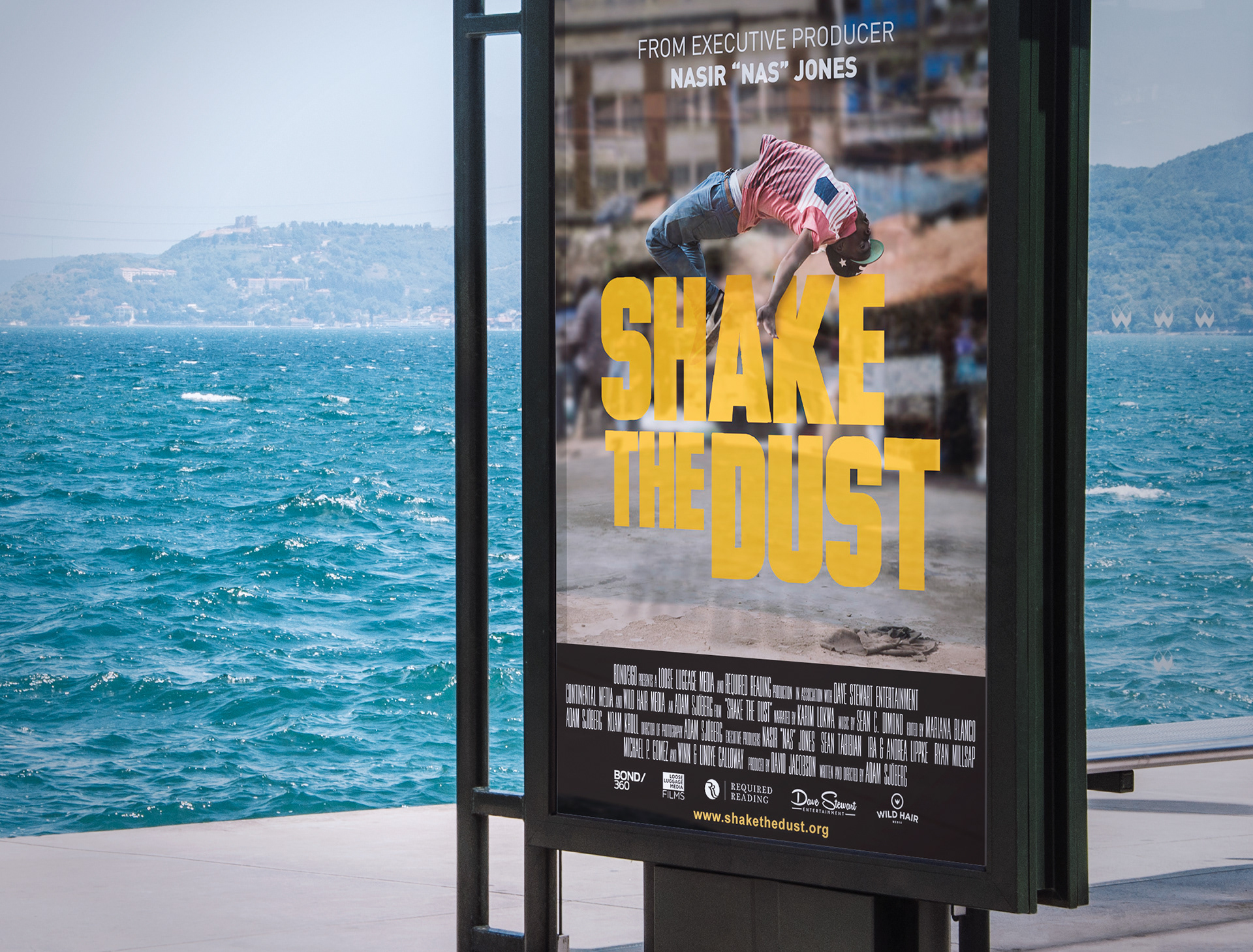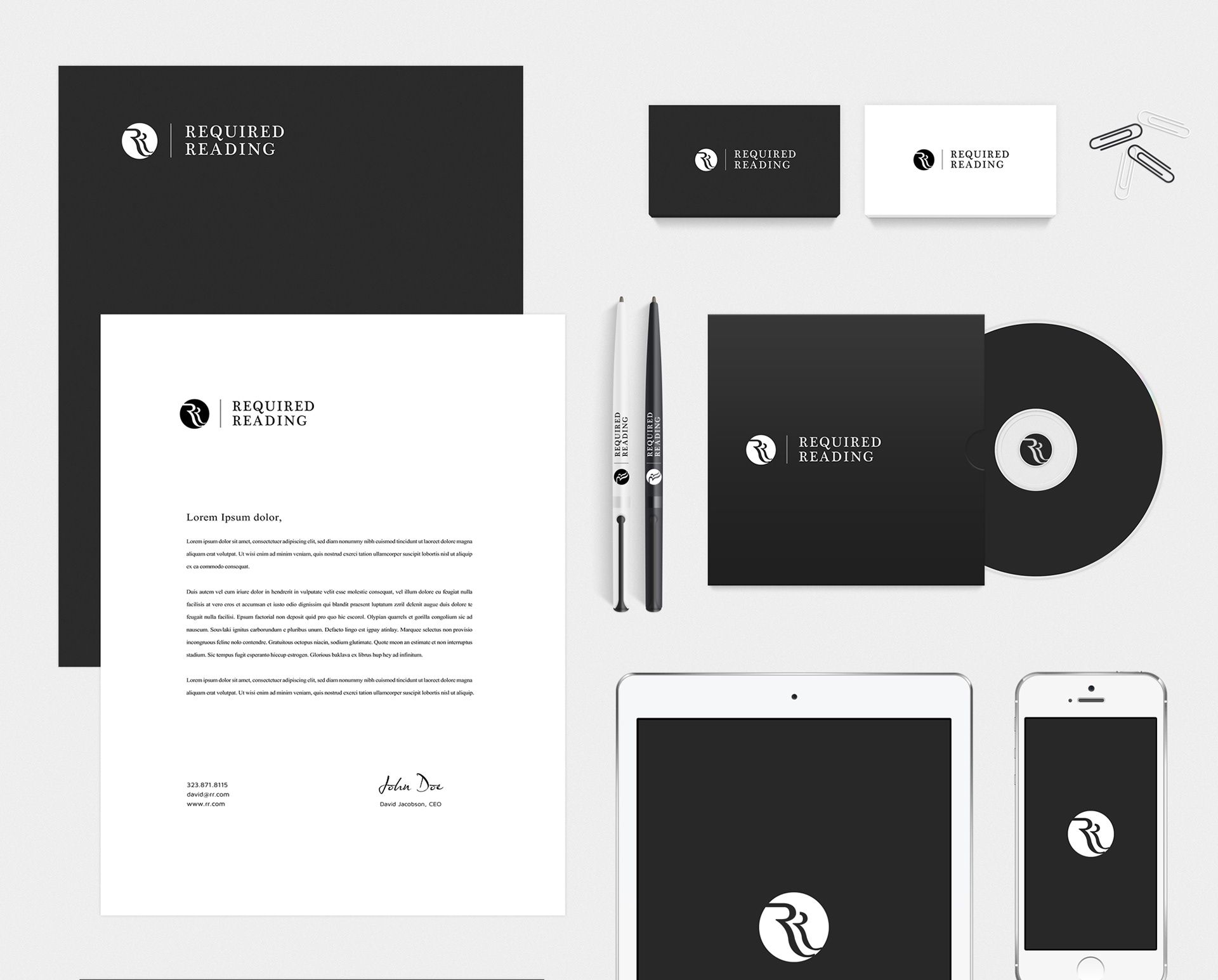
Client: Required Reading" is the label of David Jacobson's film production company. David is an independent producer & entertainment executive who produced the global breakdancing & hip hop documentary "Shake the Dust" together with the hip-hop artist Nas and film maker and photographer, Adam Sjoberg. Prior to that David he Co-Produced the high profile independent feature film, Lee Daniels "The Butler" and others more.
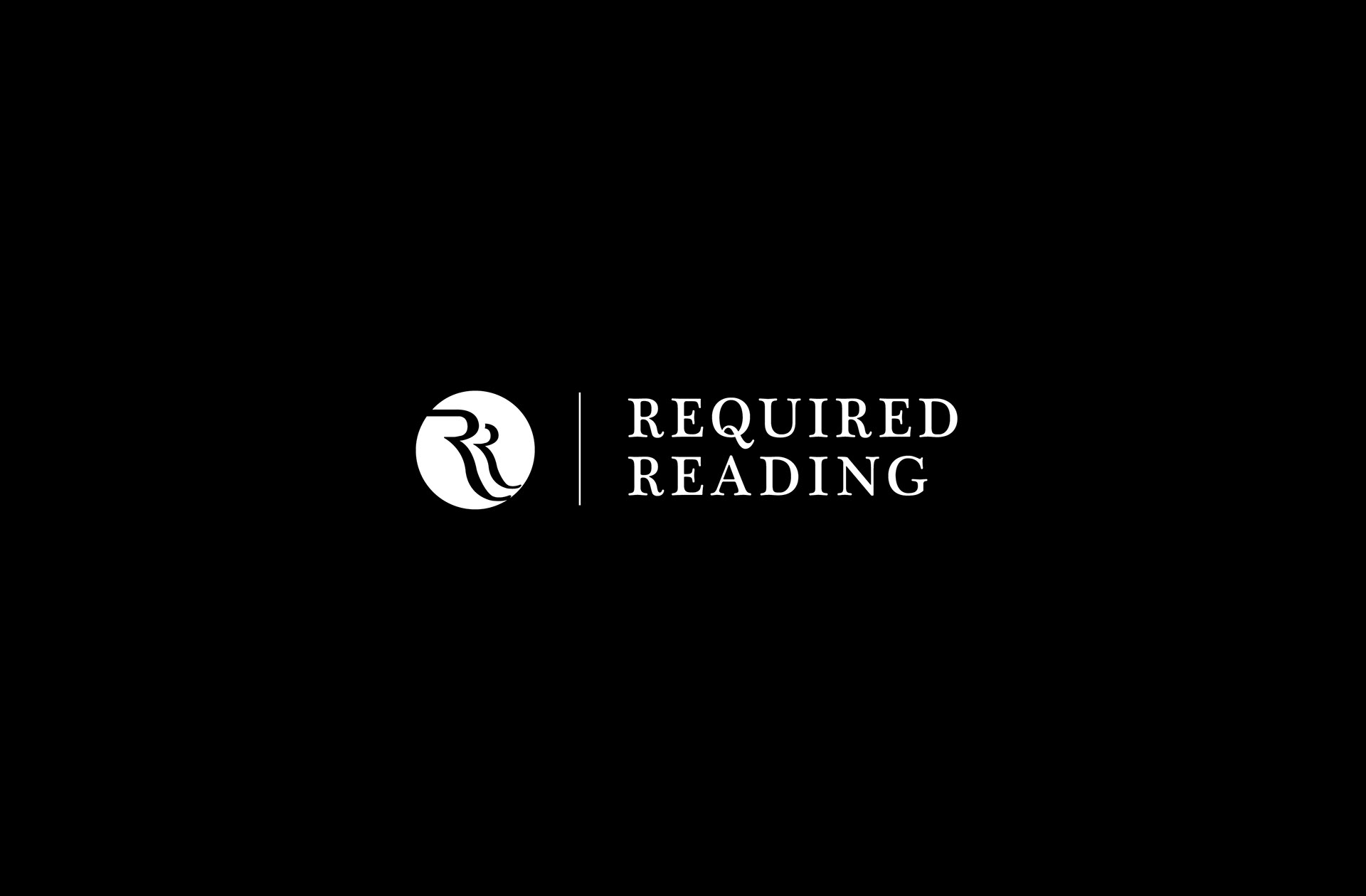
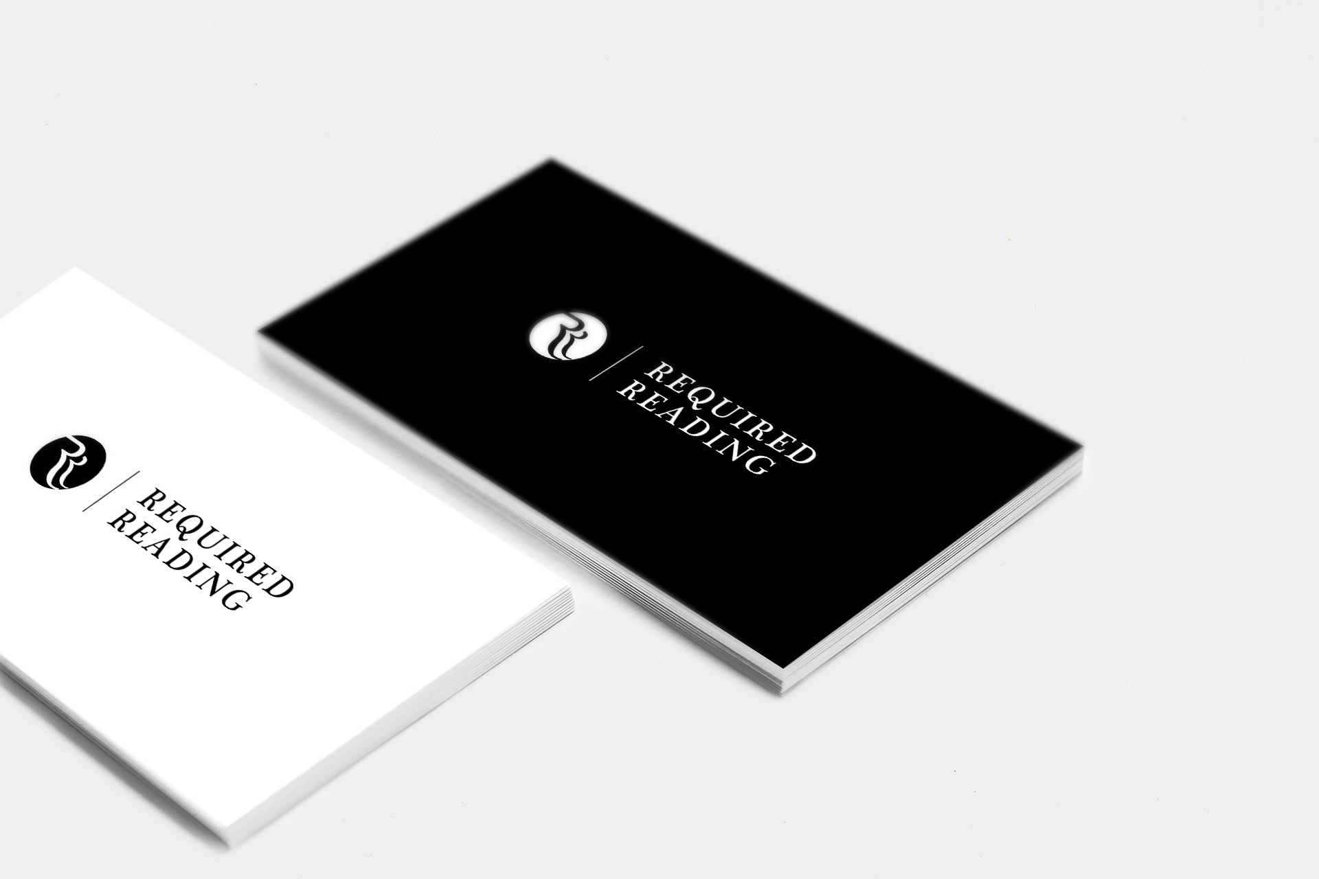
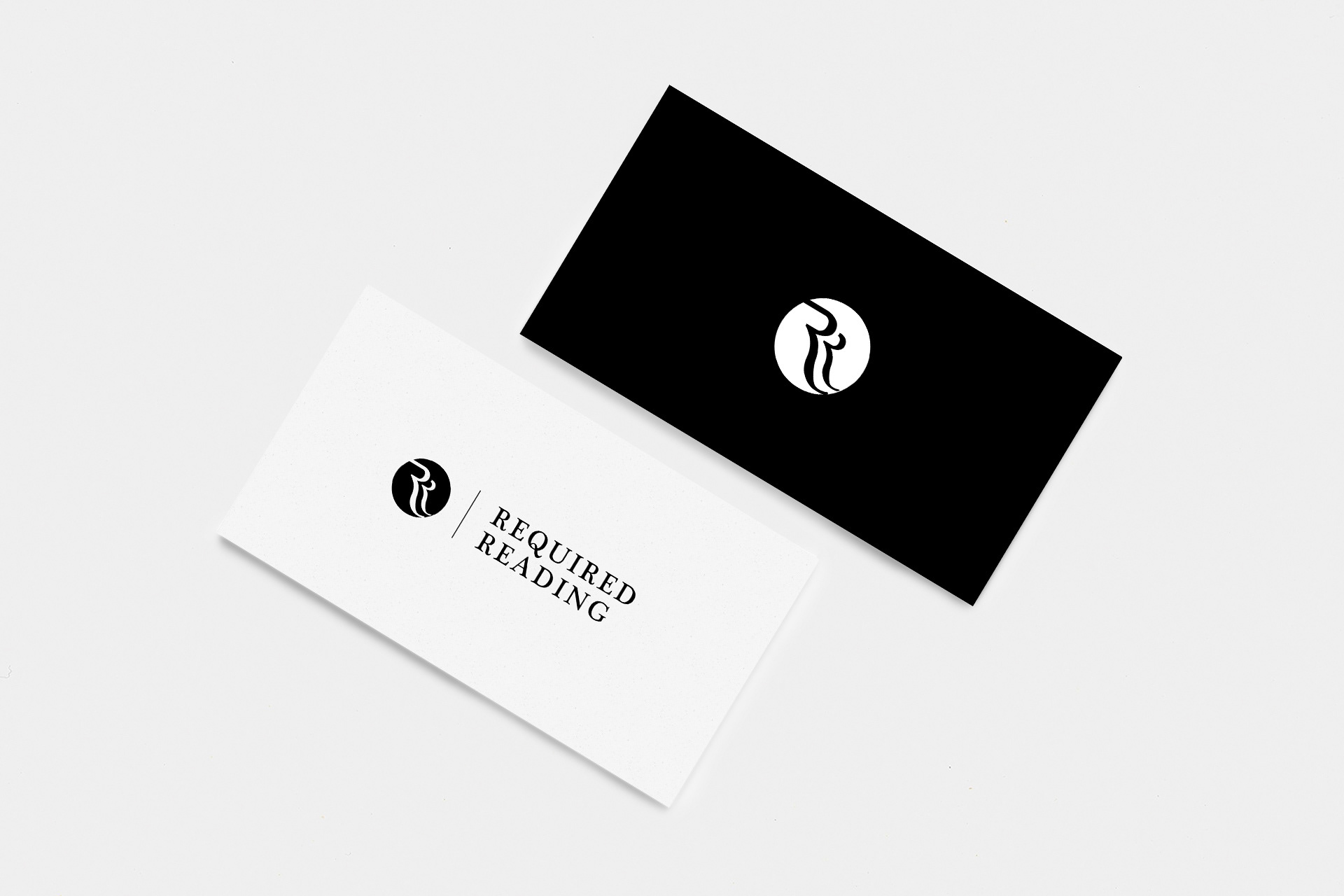
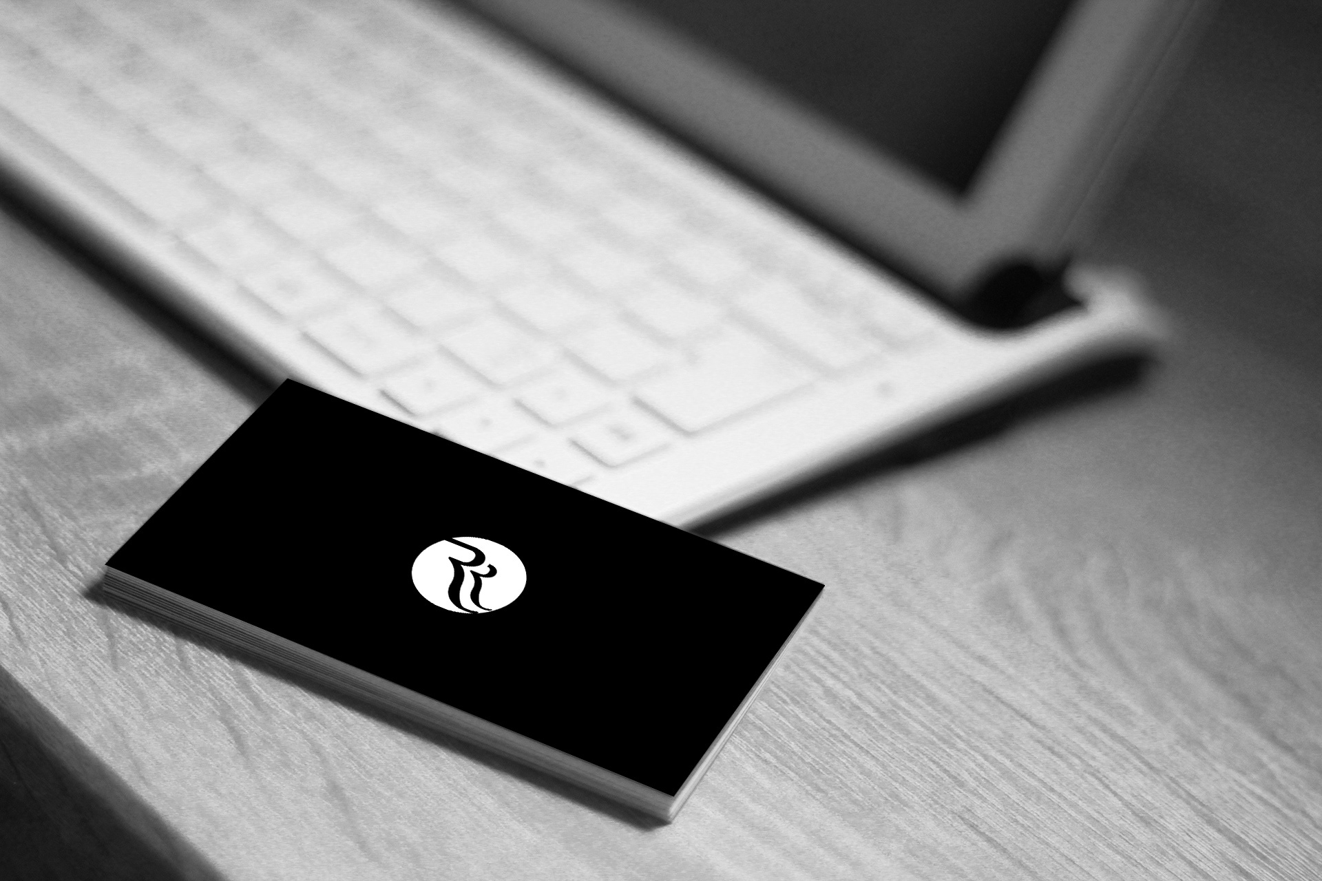
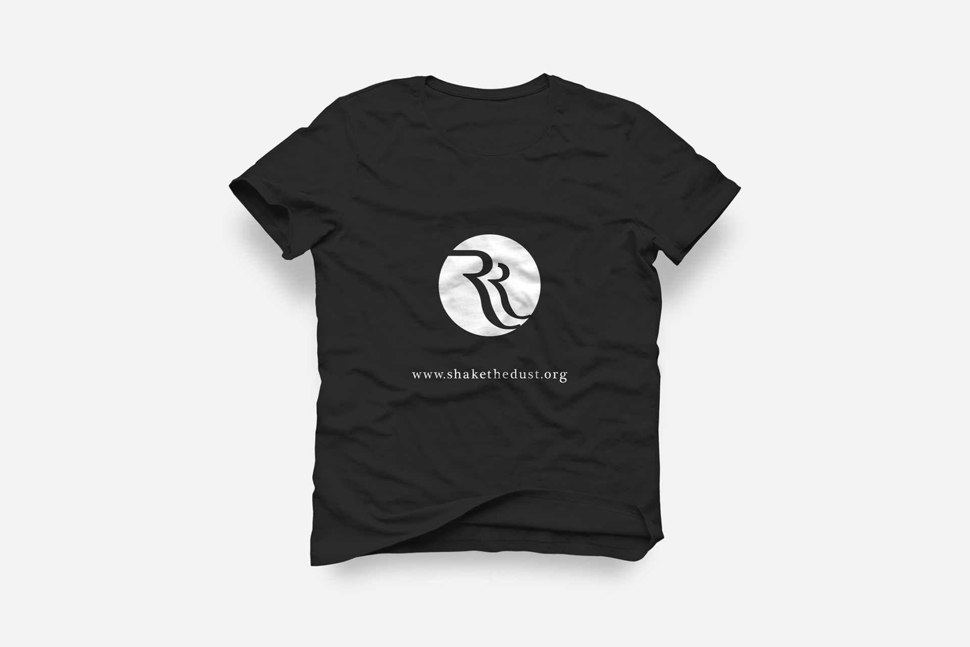
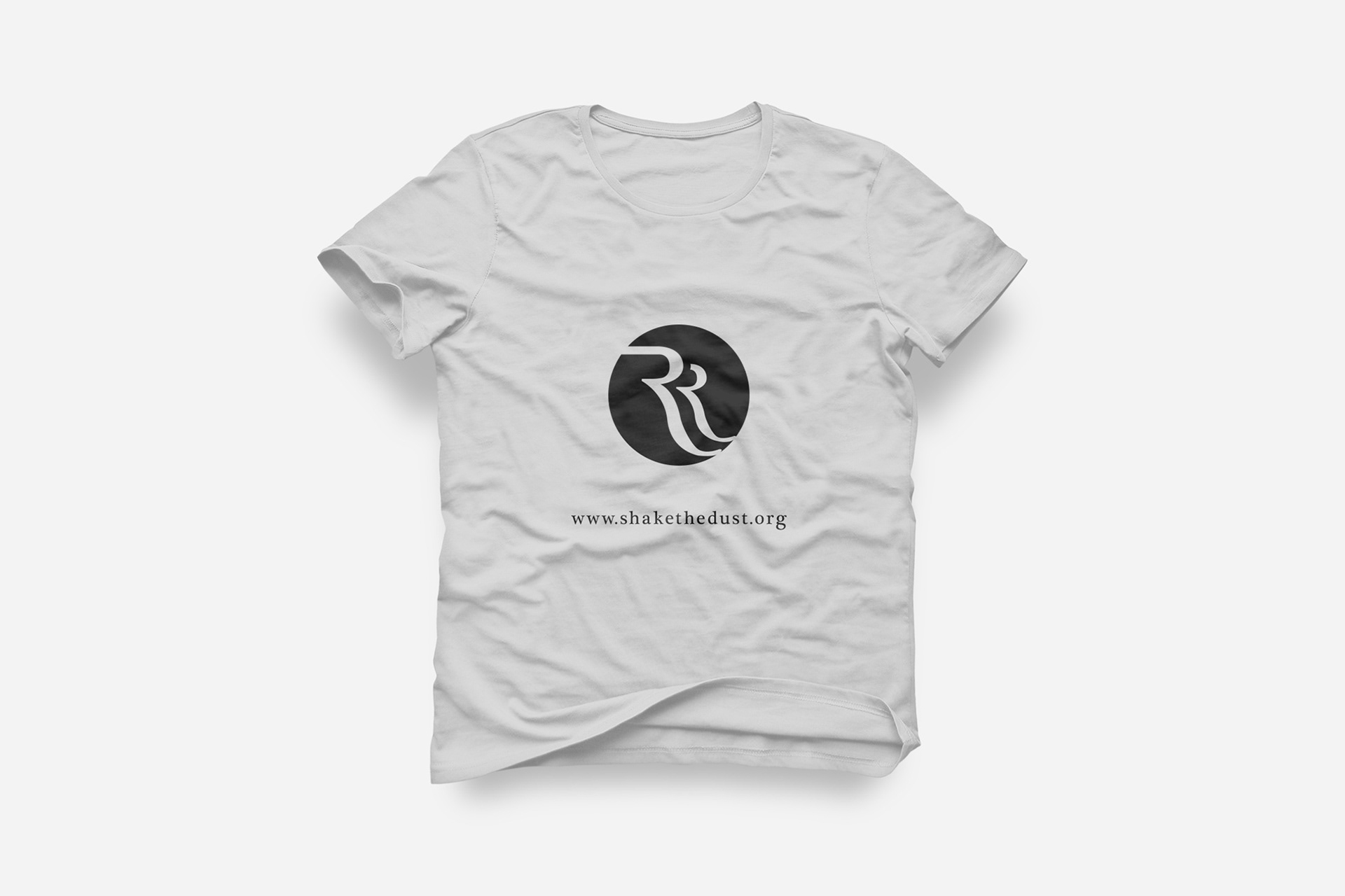
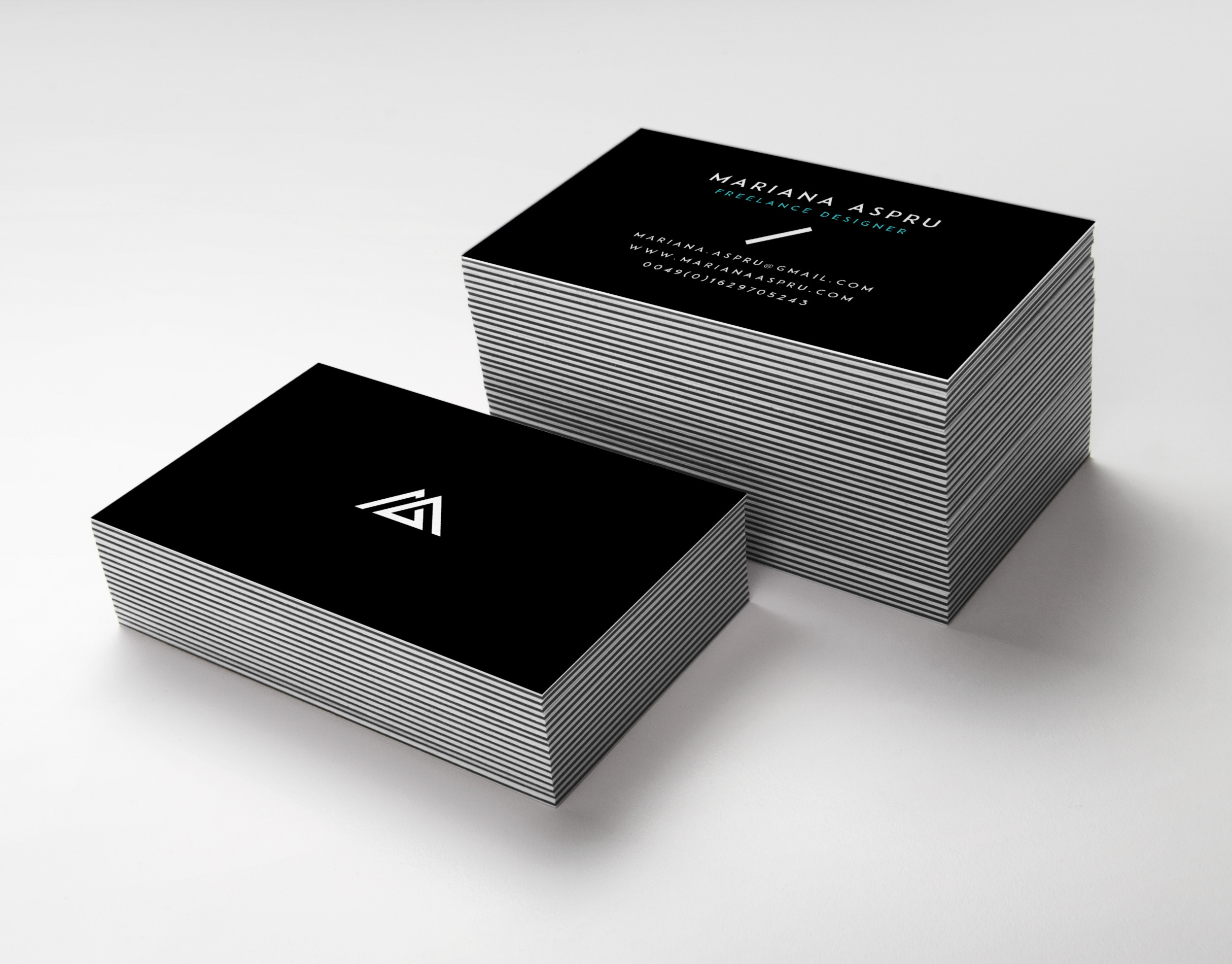
Business vision: The brand needed to look good in Black & White and the client wanted a symbol that plays with the dual letters "RR" in Required Reading in a way that captures the elegance of a type, mature, modern, but not too modern, simple and classy.
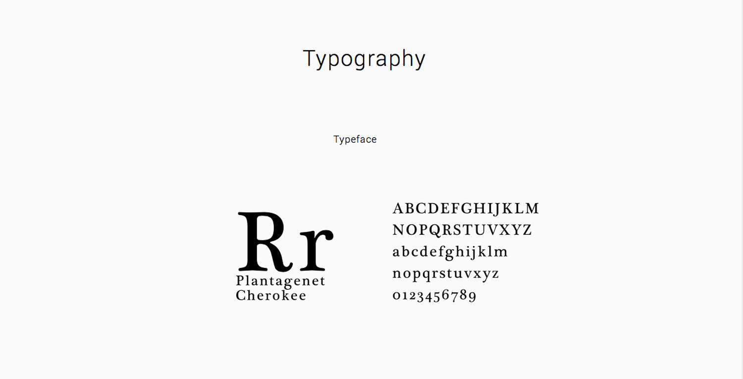
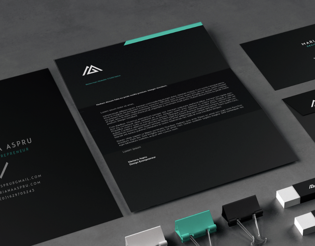
Creative solution: Based on the brand name, I created an iconic logo, using the "RR" dual letters and played with the negative space on a circle surface. The shape of the circle represents the unity and continuity of the company and has the role to communicate the sharp message of the logo. That is why, in opposition with the message, I decided to use a font which is more slimmed down, but in the same time it compliments the logo and captures the elegance of it.
Services: Logo