Client: "FAB is the first bank to put artists first. Created by artists for artists, we believe in the power of art to change the world. We are dedicated to helping artists make the most of their talents to create wealth and opportunity for themselves and provide them with the very best financial and creative services." - FAB
Business vision: The brand identity needed to have a clear and distinctive position against the rest of the banking industry, with the purpose to become the trusted partner of the global creative economy.
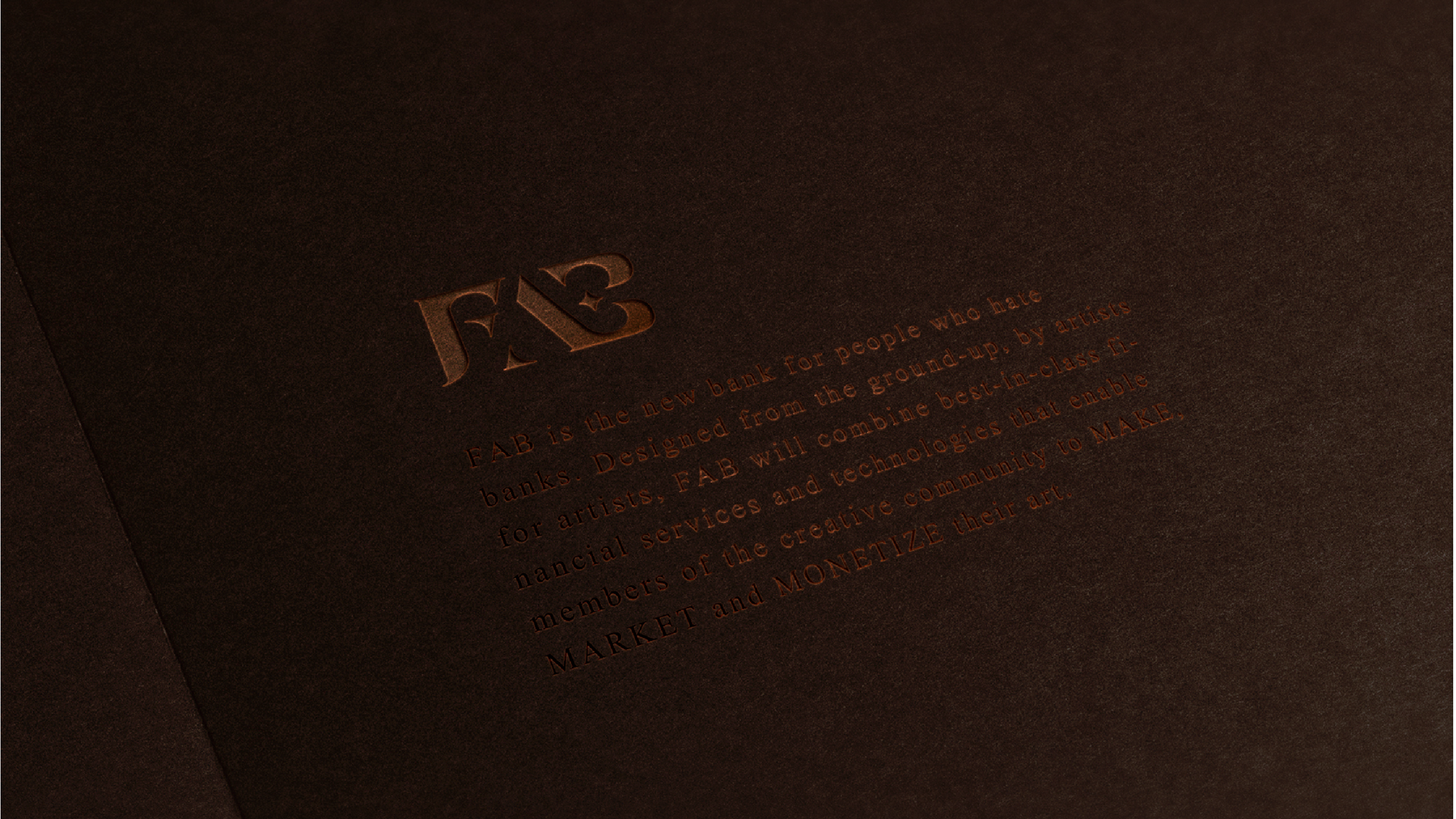
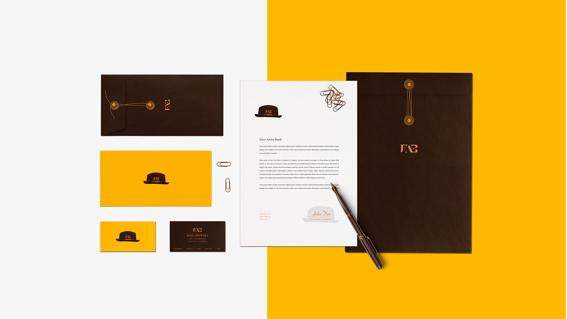
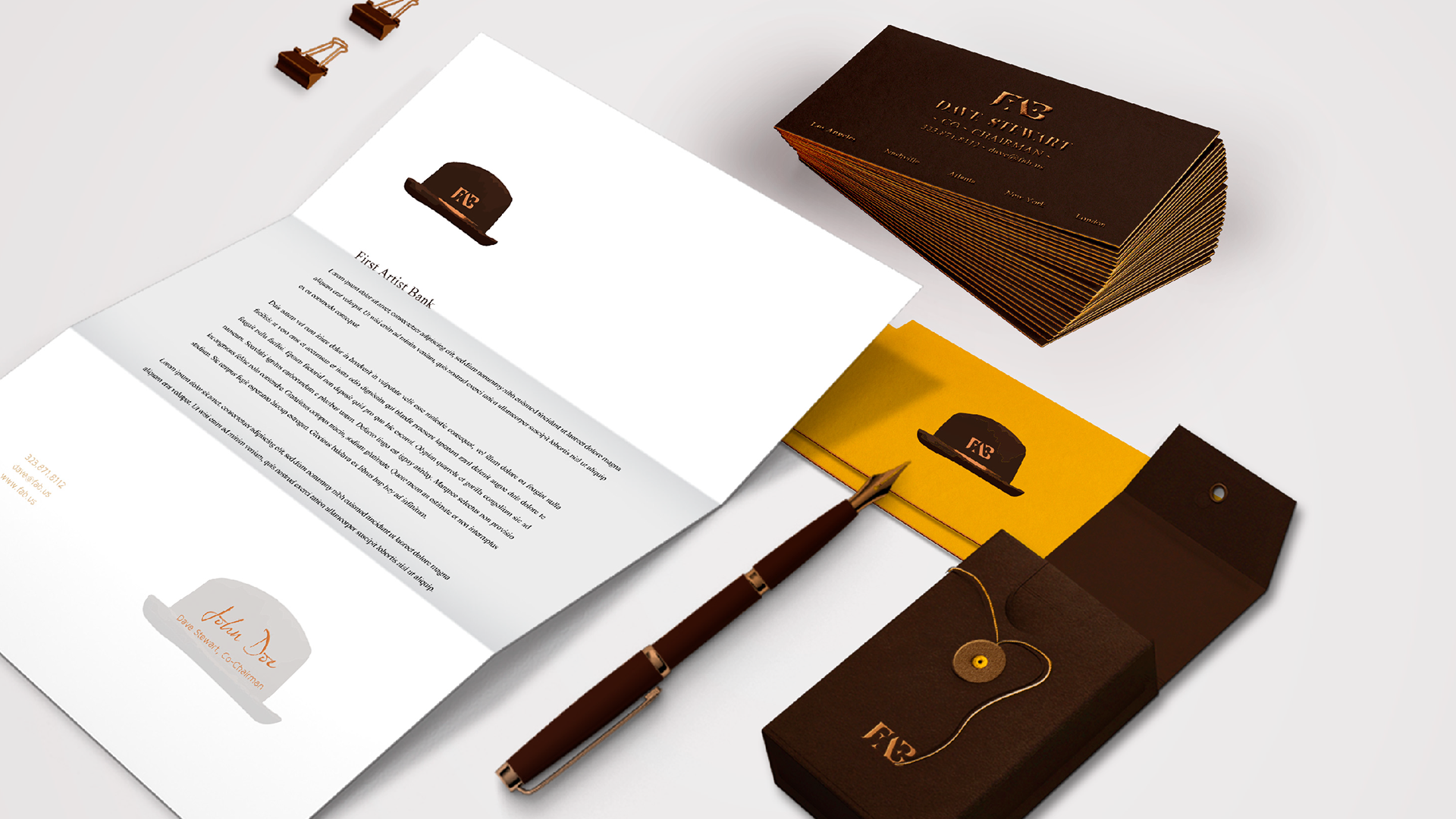
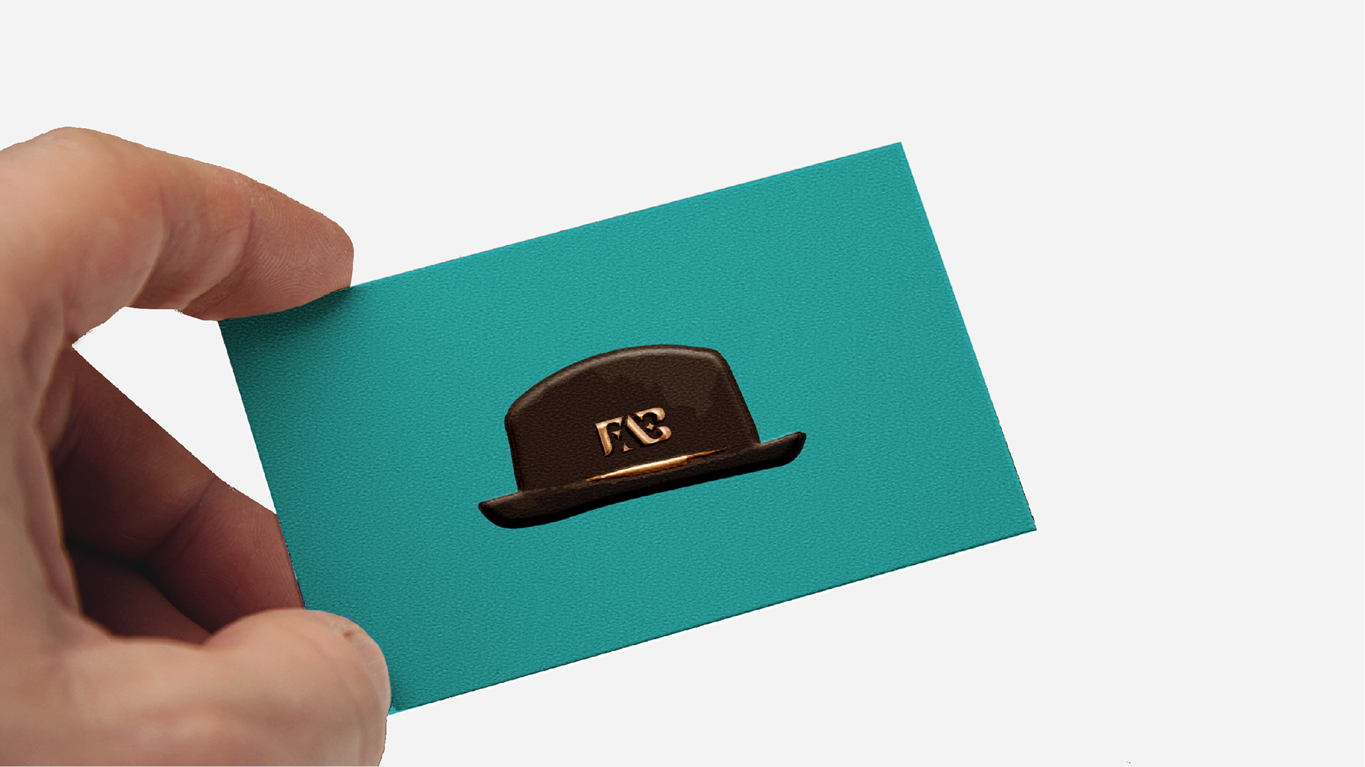
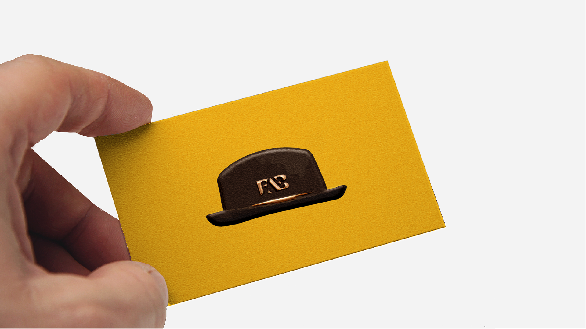
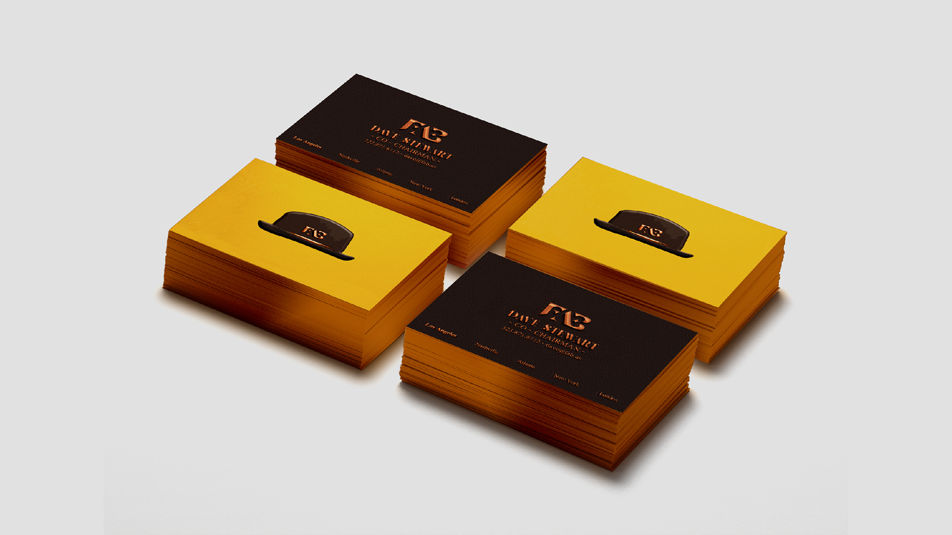
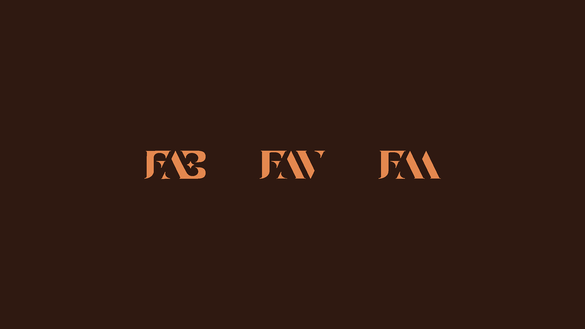
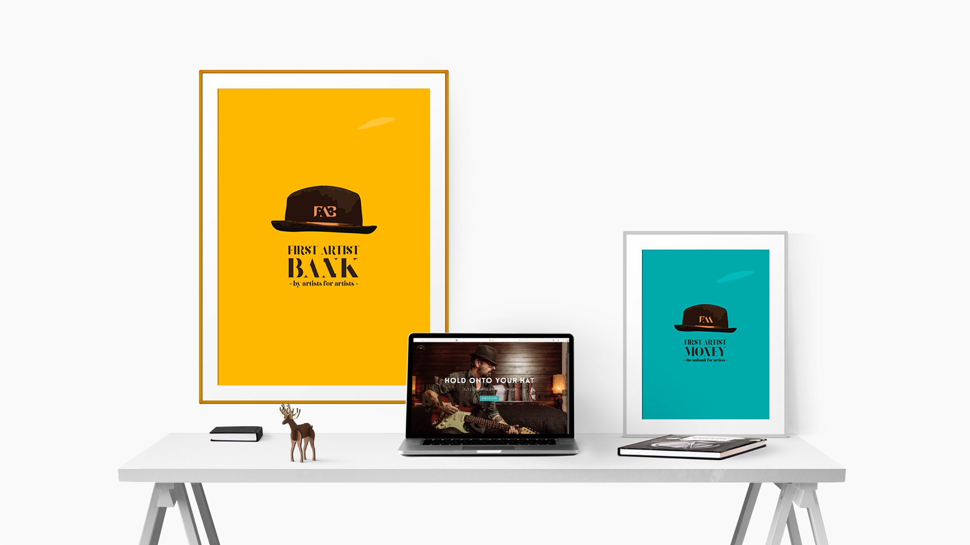
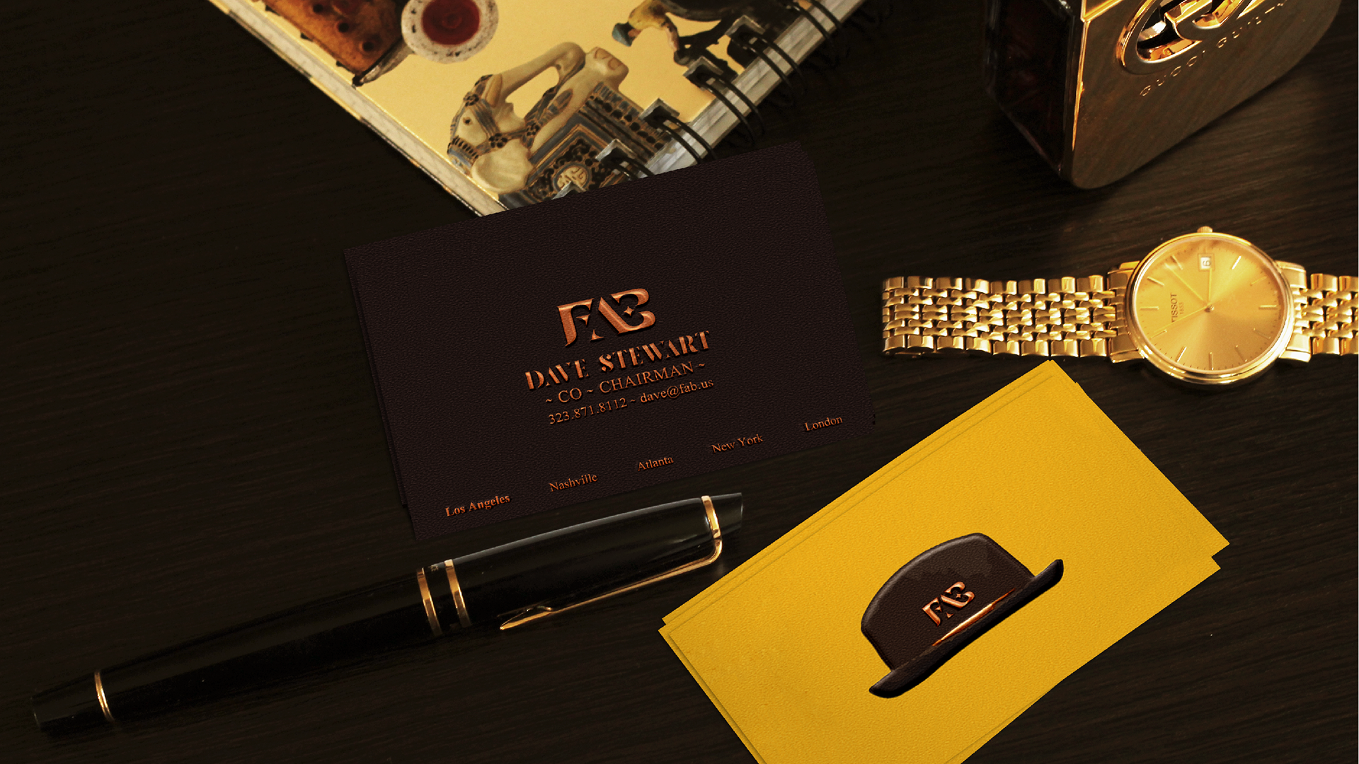
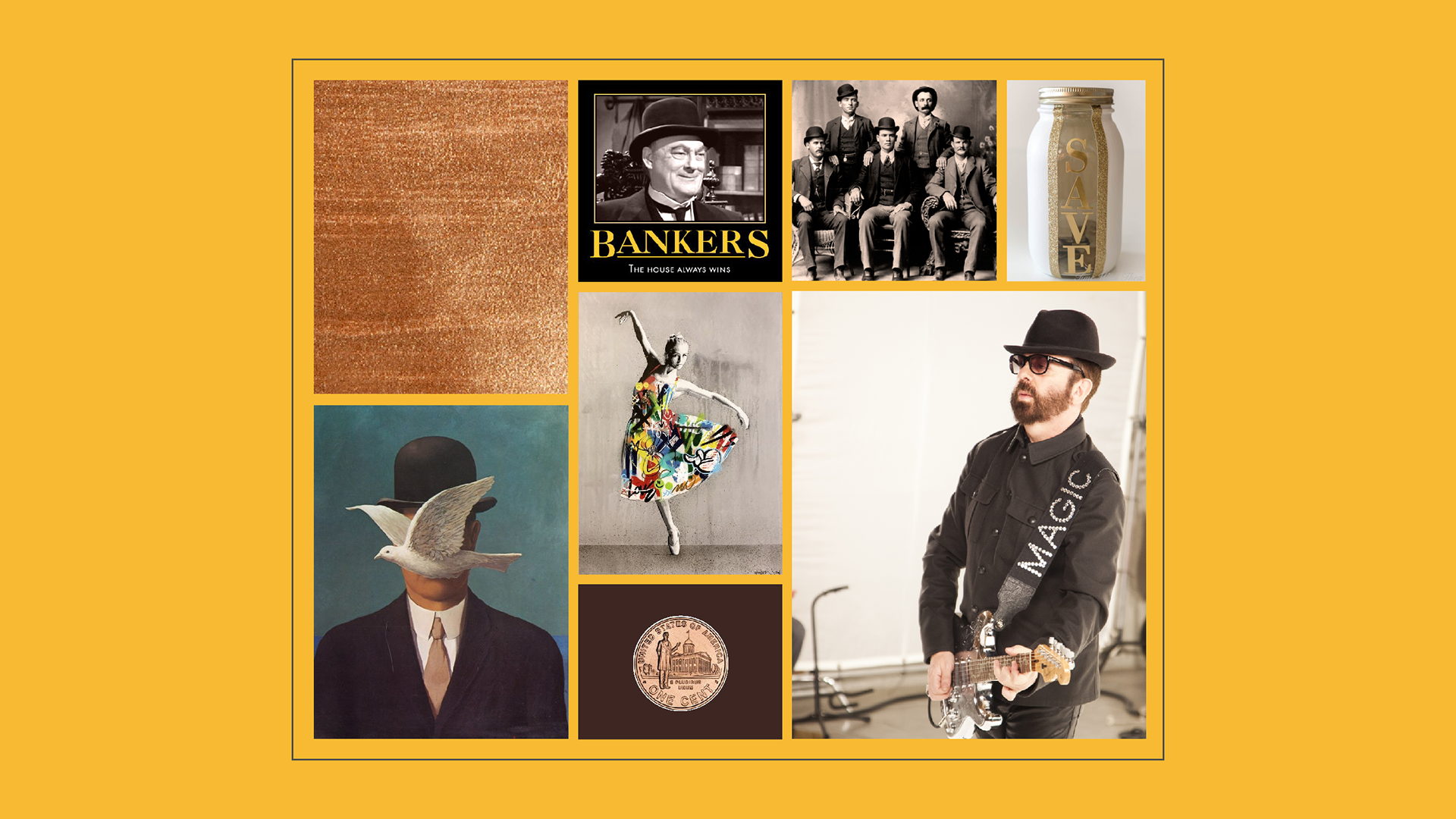
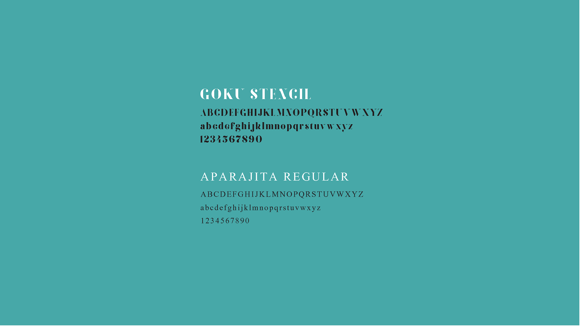
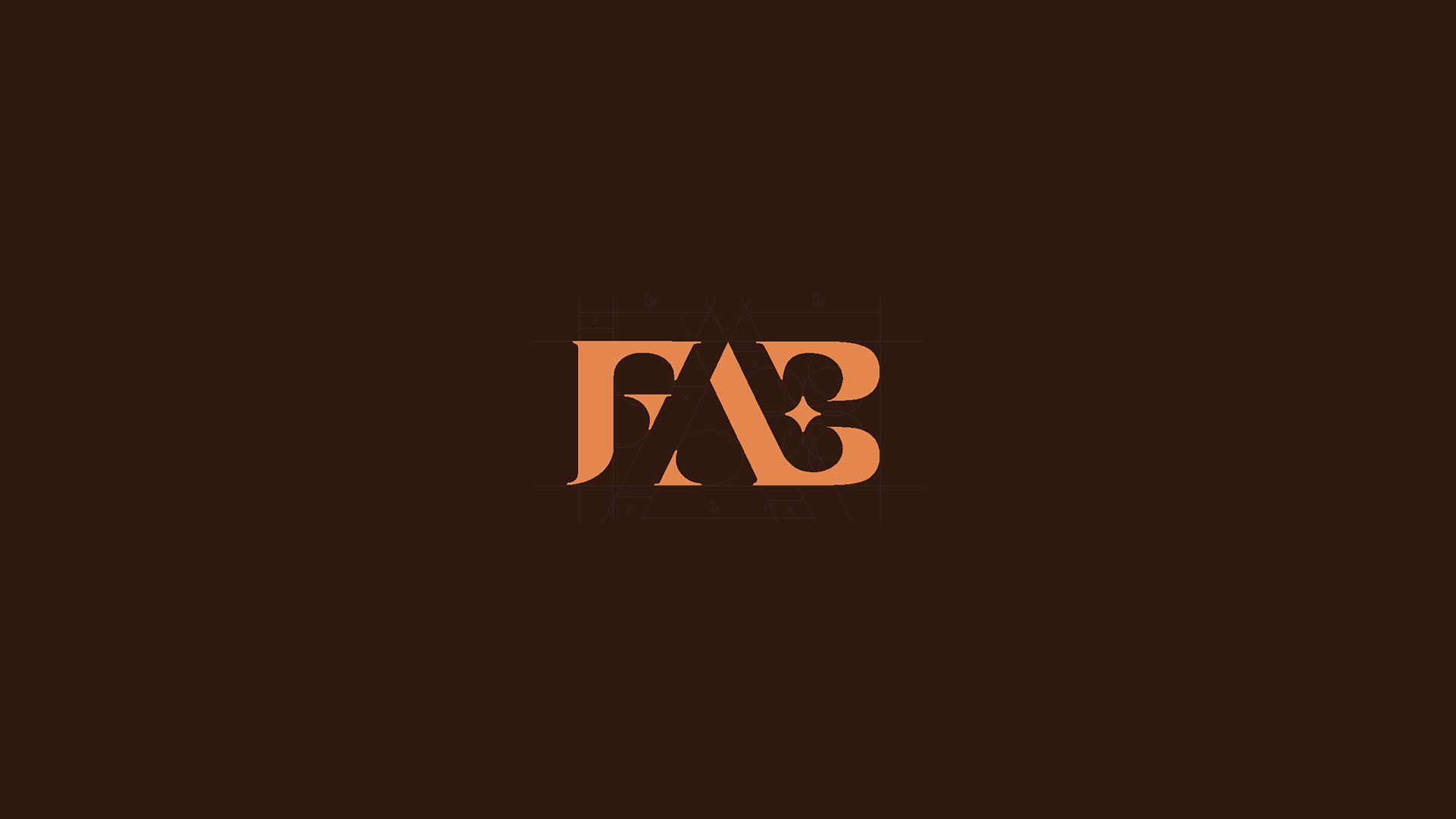
Creative solution: Starting with the idea of using “the hat” as a brand identity, this led me to design a logo with an artistic customized typeface. The overall logo reflects the shape of the hat, the integrity between artists and bankers and is flexible enough to add other letter after “FA” as well.
Services: Branding, Consultancy, Art Direction
Color palette: yellow and dark brown. Dark brown can represent the concept of a different bank and it is also a strong color that shows a good willing. Yellow is a friendly, warm color and in the same time connects easier the consumer with the service/product. The combination yellow on one side, dark brown on other side is a perfect contrast: artist and bank.Yellow can be the artist’s color, where artist=star, star=yellow. When I think of yellow, I think also of useful, valuable services/products for people and it define a sense of purpose which a brand should represent.
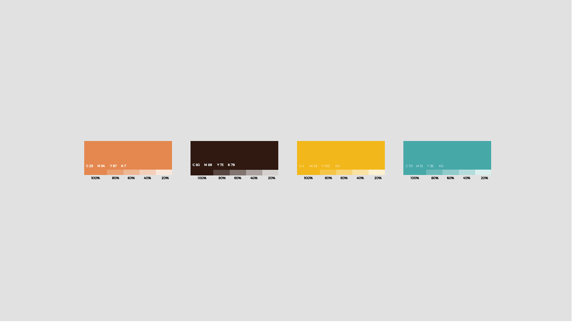
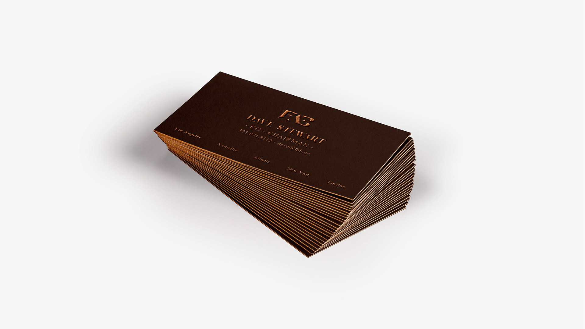
Material: For the overall brand identity, the material color used for the details is metallic Cooper. Cooper gives an outstanding, classy and high end look. The color is being used discreet, highlighting the logo and the details of the hat. Additionally business cards uses a strong material that gives the chance to use the Cooper metallic color for the edges as well.